

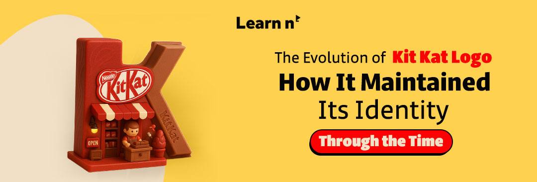
When you hear the name “Kit Kat”, the first thing that often comes to your mind is the taste of crispy chocolate, and perhaps the iconic red packaging as well. However, few are aware that the story behind its logo offers valuable insights into the brand’s strategic brilliance in adapting to change while maintaining its core identity. In this article, we will take you on a brief journey through the history of the Kit Kat logo and how it has managed to endure despite shifts in the market and evolving consumer tastes.
The Beginning of the Kit Kat Logo
Kit Kat began its journey in 1935 in England, under a completely different name at the time: 'Rowntree’s Chocolate Crisp.
- The 1930s Design:
- The first logo was simple and unembellished, featuring a clear font that highlighted the brand name 'Rowntree’s,' with an emphasis on the product itself—'Chocolate Crisp.' The focus was less on visual identity and more on introducing the new product to consumers.

The Evolution of Kit Kat Logo Through the Decades
Over the years, the logo has experienced several significant changes, each reflecting new trends in marketing and design.
In the 1950s and 1960s:
In the early 1950s, the company made a crucial decision to officially rename the product “Kit Kat”. With this change, the logo began to take on a form closer to what we recognize today:
- Bold white line
- A catchy red background
- A simple and memorable design
This change was a response to the growing popularity of the product and the need to create a strong, independent identity for it.
In the 1980s:
As consumer culture and advertising evolved, the logo underwent subtle adjustments that made it clearer and more modern.
While retaining the key elements (the red colour and white line), the logo became more balanced in its design, allowing it to appear sleek across various advertising campaigns, whether in print or on digital screens (television).
Read More: How Did Dettol Reach 16 Billion Views on TikTok with a Creative Campaign?

The Logo's Evolution with Local Cultures
The evolution wasn't just about the design; Kit Kat cleverly and naturally adapted to various local cultures.
For example, in the Japanese market, there was a unique adaptation.
Because 'Kit Kat' phonetically resembles the phrase 'Kitto Katsu,' which means “certain victory”, the brand took advantage of this similarity to strengthen its cultural presence.
In Japan, Kit Kat became a symbol of good luck, especially among students during exams, helping to deepen its connection with the local audience in a way that resonated with their everyday experiences.

The Meanings Behind the Logo Design
As mentioned earlier, Kit Kat logo was simple, but every detail in its design was thoughtfully crafted, carrying deeper meanings. For example, the use of bold, straight lines conveyed strength and confidence. The inclusion of 'Chocolate Crisp' was part of a strategy to clearly and simply communicate the product’s nature.
The curved lines in “Rowntree’s” added an elegant, refined touch, reflecting a commitment to quality and innovation.
The choice of the vibrant red background symbolized power and energy, aligning with the concept of a fun and energizing snack.
Each of these visual elements encouraged consumer engagement and motivated them to try the product. The use of bold, thick fonts reflected the product's quality, while the lighter, more delicate lines added a sense of precision and sophistication.
This balance between simplicity and distinction made the logo easy to remember and recognize, a crucial factor in building a strong brand that endures across generations.
According to a report by Nestlé, over 22 billion Kit Kat bars are consumed annually worldwide. This figure reflects the deep connection between consumers, the logo, and the product itself.

Famous Advertising Campaigns Featuring the Logo
Kit Kat's success wasn’t just built on its design, but also on clever advertising campaigns. One of the most iconic of these campaigns was 'Have a Break, Have a Kit Kat,” launched in the 1960s. The idea was simple yet impactful: Kit Kat is the perfect choice for a short break in the middle of your day.
This campaign became a true cultural symbol and is still used, in one form or another, around the world today. The message was clear: the product isn’t just chocolate, but a small moment of rest that provides energy and enjoyment.
You can watch the ad through this link:
https://www.youtube.com/watch?v=Qas5wAEb4rc
In recent years, Kit Kat has embraced more interactive concepts, such as the 'Kit Kat Chocolatory' campaign, which highlighted the variety of flavors and the ability to customize the experience. This campaign emphasized comfort and enjoyment, aligning perfectly with the logo’s simple and appealing design.
The story of Kit Kat logo teaches us that change doesn’t always mean abandoning identity. On the contrary, sometimes smart and continuous updates are the key to keeping brands alive in the hearts of consumers.
So, don’t chase complexity just to grab attention. Thoughtful simplicity, combined with smart repetition, can create a much stronger impact. Stay true to the essence of your brand, while being flexible in how you present it to fit different cultures and markets, making it an enduring symbol in the world of marketing and advertising.
FAQ
- How do logo changes impact a brand's strategy?
Logo changes help a brand adapt to current trends and its target audience, without compromising its core values. By updating the logo, the brand remains able to attract new segments while maintaining loyalty among its existing audience.
-
Do companies always need to change their logos to stay updated?
Not necessarily. Logo changes should be well-considered and aligned with market developments, but companies can maintain strength with a consistent identity as long as the logo truly reflects their values and vision.
-
How can brands balance updating their logo while preserving their heritage?
Brands should balance maintaining visual elements that tie them to their history with adding modern touches. This can be achieved by updating small details without altering the essence, such as refreshing fonts or colours while staying connected to the original identity.
Share Your Thoughts
Do you believe that the slight changes to Kit Kat logo were necessary to maintain its position, or would it have been better if it had remained as it was in the 1930s?

Author
Learn n’ Digital Team